Colors do have an impact on your sensory experience, and visual aesthetics. The curtains, walls, and carpet have a significant effect on the outcome of your design. We have researched every aspect you need to know about creating balance and harmony within the colors.
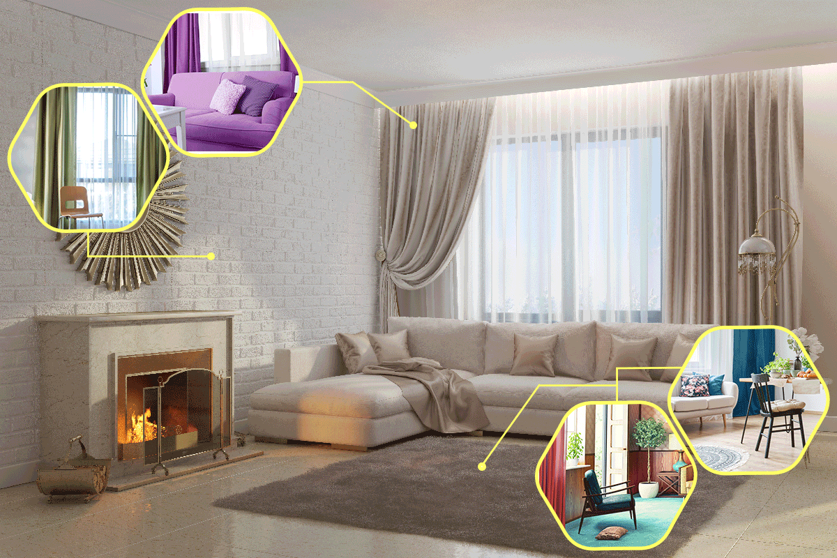
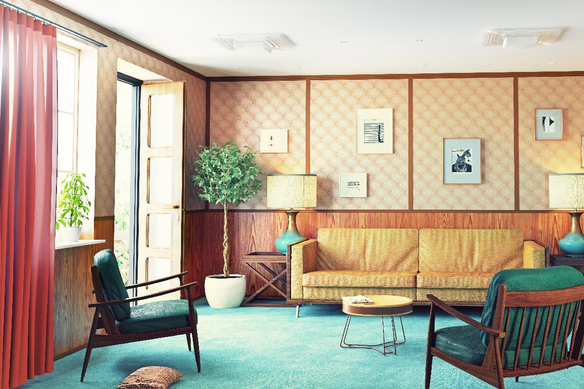
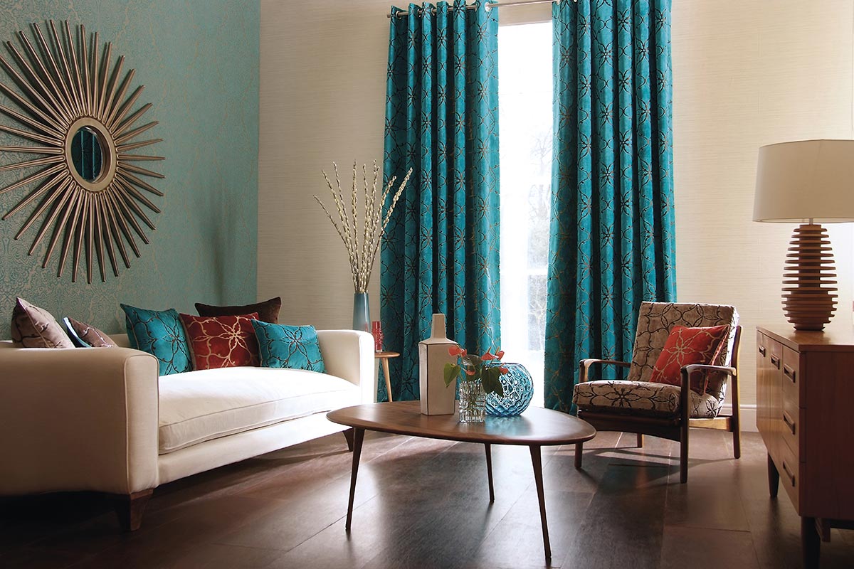
Curtains do not necessarily need to match carpet or walls. In fact, using a contrasting hue actually creates more visual appeal. For instance, a white-colored wall is best paired with dark curtains. Matching your curtains with the room's accent color is always advisable.
Arranging your room is actually a relaxing activity. Matching the right colors is a matter of preference, choose shades and hues that please and match your taste. This article aims to inform you on the basics of color combinations and their effects on the general appearance of your home.
Color Theory And Color Wheel
Before we delve deeper into the topic, we must first have a brief understanding of color theory and the importance and effects it holds in interior design.
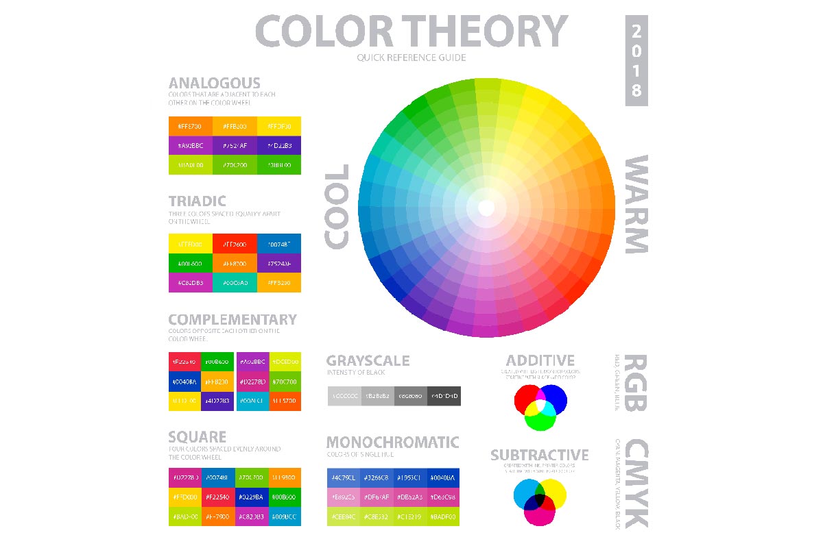
Color theory functions as a guide for combining or mixing colors in order to create a more harmonious relationship. It basically uses the color wheel as its main tool to determine the perfect color combinations.
Although it may seem insignificant, colors affect and impact the tone and mood of a room, determining its overall aesthetic characteristic and sensory experience. Not only that, colors have a vital effect on human psychology. People typically use various color schemes to create different ambiances and moods.
The color wheel comprises primary, secondary, and tertiary colors, all of which are visible to the human eye. They consist of different hues, shades, and tones.
Types of Color Scheme
The different types of color schemes are derived from the color wheel. By having a brief understanding of the various pigment variations, you can build or create the perfect balance.
Monochromatic
Monochromatic refers to all shades of a single hue; for instance, the various colors of blue such as cyan, navy, turquoise, midnight blue, and sky blue.
A blue curtain paired with a sky-blue wall, and baby blue furniture touched with a classy white accent and light-brown flooring can have a soothing and calming effect.
Complementary
Complementing colors are pigments that are on the opposite sides of the wheel, meaning they have contrasting or clashing colors. Some examples are red and green. With this being said, you may be wondering why black and white are not on the color wheel.
Colors (visible light) have specific wavelengths that our eyes use to perceive or distinguish them. To illustrate, blue has a different wavelength than red. In physics, white and black are not considered true colors because they do not hold significant wavelengths.
Black does not have any wavelengths while white contains all wavelengths of colors combined together. In other words, black is the absence of pigments while white is the presence of all visible light.
While this is the case, dark paired with light shades create a striking aesthetic appeal, especially if matched correctly.
Analogous
Analogous refers to the group of three pigments positioned next to each other on the color wheel. It uses one dominant color that would take up the bulk of your design (usually a primary or secondary), a supporting pigment, and a third color that basically accentuates the entire combination.
This creates a vibrant monochromatic effect. Blue-green, green, and yellow-green are examples of this pattern.
An analogous color scheme is often depicted in nature. A setting sun paints the sky with a hint of red, orange, and yellow while succulents create striking hues of blue, blue-green, and green leaves.
Triadic Color Scheme
A triadic color scheme is a combination of three pigments in the color wheel that have an equal triangular distance from each other. Violet, orange, and green are examples. Other visible shades on the wheel are turquoise, fuchsia, and yellow-orange.
These combinations basically form a color scheme that creates balanced contrasts ideal for living rooms. They typically suggest a cheerful motivating aura. Apart from this, you should also use those three colors in varying shades and tints to avoid creating an overly bold and overwhelming atmosphere.
Important Considerations
Base your secondary and accent colors on the wall since it is permanent and serves as the main backdrop. The wall should be soft-toned, neutral, and subtle so that it would be easier to be paired with.
Your curtains and furniture serve as your secondary, while the carpets, pillows, artworks, and other room designs function as the accent.
How To Choose The Right Color
60-30-10 Rule
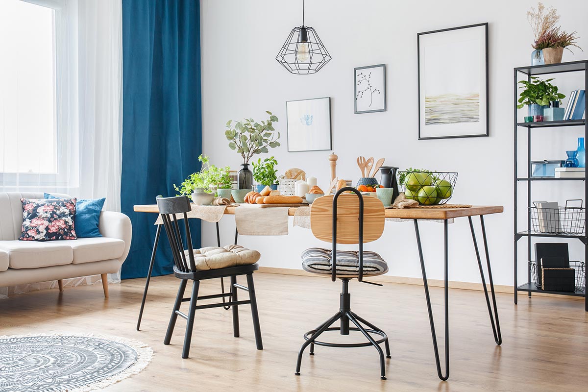
60-30-10 is a general guideline that helps you determine pigments that will complement one another. Before choosing hues and patterns, it is important to plan the color schemes you intend to use. You can start by selecting three colors - main (60% of the room), secondary (30%), and accent colors (10%).
You can combine hues of white, dark brown, and beige. To illustrate, you can paint your walls white, use beige-colored furniture to complement the main shade, and incorporate dark-brown throw pillows to accentuate the overall palette or to give a strong appealing contrast with the lighter shades. Dark brown curtains with white blinds will perfect the harmonious relationship of the design.
Balance Color Temperature
Color temperature refers to the warmness and coolness of colors. Yellows, reds, and orange are considered the former, while blues, greens, and violets are classified as the latter.
In our example above, the two shades of brown are warm colors while white is a neutral shade. The balance between the two does not create a clashing background effect. If you intend to pair it with cool colors, you can do so by using a light blue table runner, carpet, or throw pillow instead of dark brown.
Add Neutral Shades
Since bold colors can be quite overwhelming, we recommend that you add neutral tones to conjure calmness. Adding neutrals is the best way to complement the overall design. In our example above, white acts as our neutral shade.
Use The Color Wheel
For guidance and additional insight, you may use an adjustable color wheel. By doing so, it will be easier for you to judge undertones and to create or match harmonious colors more precisely.
Should All Curtains In A House Match?
All curtains in a house do not necessarily need to match. You can play with various colors depending on your preference and the general atmosphere of the room. For instance, the wall color of your dining area is different than the living room. Choose curtains that complement the varying hues, use the 60-30-10 rule as your guide.
Three things you must keep in mind are creating balance, ensuring contrast, and selecting a color palette that eventually combines and creates harmony between all pigments.
It is advisable to follow this guideline when redesigning all the functional rooms in your house, so as to not create a dull monotonous aura.
Creating Balance
Let us use our example from above - a color palette of white, beige, dark brown, and light blue. Here, we used analogous colors of brown paired with white which functions as a neutral shade. The combinations do not invoke a disorderly or messy outcome; thus, creating balance.
Creating Contrast
Similar to our example - since brown is a warm color, incorporating cool hues would create a balanced contrast within the design. If all the pigments you chose are all cool colors, then it will invoke a chilly atmosphere. On one hand, if you focused on warm colors, the room would feel quite overwhelming.
To resolve this, you may use light blue throw pillows, carpet, or table runners to visualize a soft contrast between the two shades of brown. The curtains can still have a dark brown appearance that is paired with beige-colored blinds.
Color Palette
Once you have settled with the colors you like, you have now created or produced a color palette that suits your taste, and that is compatible with the room.
In Closing
Colors do have an effect on the atmosphere of the room, and the overall mood of a person. Use shades, pigments, and hues that represent your own personality and characteristic. With that being said, we hope this article proved to be helpful.